
What is an HR dashboard? ?
The HR dashboard enables you to make decisions that will have a positive impact on your company, thanks to a series of monitoring indicators (HR KPIs). Its purpose is to provide a clear, real-time view of the health of the organization’s human resources and the effectiveness of HR practices. It is fundamentally different:
Operational reporting : The latter is often static, exhaustive and descriptive (e.g.: list of monthly hirings). The dashboard is dynamic, synthetic and oriented towards analysis and action.
Complex Excel file : Although Excel can be a construction tool, a dashboard is characterized by its automation, interactivity and visual dimension, enabling intuitive data exploration.
A well-designed dashboard serves four main purposes:
- Performance management: Monitor the effectiveness of HR processes (recruitment, training, etc.) and their impact on business performance (productivity, costs).
- Anticipate risks: proactively identify weak signals, such as a rise in turnover in a key department or latent disengagement, to enable correction before the situation deteriorates.
- Convince and align: Objectivize discussions with senior management by backing up budget requests (training, salary increases) with figures and demonstrating the alignment of HR strategy with corporate objectives.
- Evaluate impact: Measure the return on investment of HR actions and policies implemented (e.g.: impact of a training program on productivity, effect of a teleworking policy on commitment).
Key Indicators by Steering Area
The selection of indicators is the most critical step. They must be aligned with corporate strategy, actionable and based on reliable data. Here’s a categorization of essential HR KPIs.
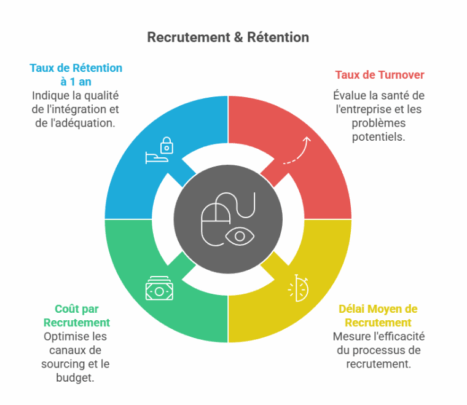
Recruitment & Retention
| Indicator | Calculation Formula | Objective & Insight |
| Turnover rate | (No. of departures over 1 year / Average workforce) x 100 | A thermometer of a company’s health. A high rate indicates problems of culture, management or remuneration. Too low a rate may indicate inertia. |
| Average recruitment time | Number of days between publication of offer and signature of contract | Measures the efficiency and agility of the recruitment process. If you wait too long, you lose out on quality candidates. |
| Cost per Recruitment | (Total process cost / No. of recruitments) + Integration cost | Optimize sourcing channels and budget recruitment campaigns. |
| Retention rate at 1 year | (No. of employees present for 1 year / No. of new hires 1 year ago) x 100 | Key indicator of integration quality and recruitment suitability. |
Commitment & Culture
| Indicator | Calculation Formula | Objective & Insight |
| eNPS (Employee Net Promoter Score) | % Promoters – % Detractors | Measures loyalty and overall satisfaction. “On a scale of 0 to 10, how likely are you to recommend our company as a good place to work?”. A positive score (>5) is good, >8 is excellent. |
| Absenteeism rate | (No. of days absent / No. of theoretical days worked) x 100 | Indicator of well-being and commitment. A sudden rise in a team may signal a problem with management, workload or working conditions. |
Development & Performance
| Indicator | Calculation Formula | Objective & Insight |
| Internal promotion rate | (No. of promotions / Total workforce) x 100 | Reflects the dynamic mobility and career prospects offered to employees. |
| Training Participation Rate | (No. of employees trained / Total workforce) x 100 | Measures skills development effort. To be coupled with effectiveness indicators (impact on post-training performance). |
| % of Objectives Achieved | (Nb of individual objectives achieved / Nb of total objectives) x 100 | Indicates collective performance and team alignment with strategic priorities. |
Compensation & Compliance
| Indicator | Objective & Insight |
| Professional Equality Index | Mandatory in France (companies with more than 50 employees). A 100-point score measuring the gender pay gap. Publishing it is a legal obligation, but following it is an imperative for social justice and the employer brand. |
| Personnel Expense Ratio | (Payroll / Sales) x 100 |
Basic principle: Start by selecting 3 to 5 indicators maximum corresponding to your current priority issues (e.g.: a problem of high turnover and lengthy recruitment). Once you’ve mastered this first dashboard, you can gradually add to it.
Design Methodology and Tool Selection
Building an effective dashboard is a project in its own right. It follows a precise logic, from definition of the need to production.
Step 1: Identify stakeholders’ needs
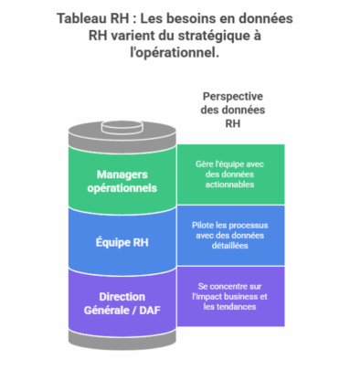 A single dashboard can’t serve all audiences. It’s crucial to segment users and their needs:
- General Management / CFO : Need for a strategic and synthetic vision (turnover, HR costs, commitment, diversity). Focus on business impact and trends…
- Operational managers : Need an operational view of their team (absenteeism, workload, skills, department turnover). Data must be actionable on a daily basis.
- HR teamNeed a detailed, analytical view of processes (recruitment lead times, efficiency of sourcing channels, training ROI).
Step 2: Audit and consolidate data sources
Data quality is the foundation of the dashboard’s credibility. This is the most technical stage.
- Identify sources: HRIS (Workday, SAP, Peoplesoft), payroll software, recruitment tools (ATS), engagement surveys (HappyIndex, Culture Amp), timesheets, etc.
- Data cleansing and harmonization: This is the most time-consuming stage. It involves correcting inconsistencies and duplicates, and standardizing formats (e.g. uniform department naming).
- Create a single source of truth: Ideally, data should be consolidated in a data warehouse or, to begin with, in a cleansed master file.
Step 3: Choose your data visualization tool
The choice of tool depends on budget, in-house technical skills and the need for automation.
| Tool | Advantages | Disadvantages | Target audience |
| Excel / Google Sheets | Free or inexpensive, great flexibility, known to all. | Manual, error-prone, difficult to maintain and automate for large volumes. | Small structures, beginners, prototypes. |
| BI Solutions (Power BI, Tableau, Qlik) | Powerful visualizations, native connection to numerous sources, automation and real-time updating, highly interactive. | Learning curve, cost per user license. | Any company looking for a robust, scalable solution. |
| HRIS-integrated modules | Pre-integrated data, no development required. | Not very flexible, often less powerful in terms of visualization, vendor-dependent. | HRIS users looking for standard reporting. |
| Specialized HR solutions (Factorial, Lucca) | Interface dedicated to HR indicators, easy to use. | Less effective for cross-analysis and non-HR data, limited functionality. | SMEs without technical expertise. |
Recommendation: For a sustainable data-driven approach, investment in a Business Intelligence solution such as Microsoft Power BI (widely used in companies) or Tableau is the most cost-effective.
Step 4: Data visualization and zoning design
Design determines understanding. Adopt these rules:
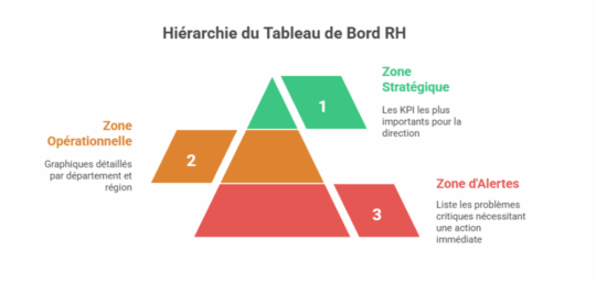
Zoning: Structure the dashboard into distinct zones. Here’s an example of what’s possible:
- Strategic Zone (top): The 5-6 most important KPIs for the DG, with their trend and a green/orange/red color code.
- Operational area (center): Detailed graphs by department, region, trade (e.g. turnover by team).
- Alert zone: An insert listing critical deviations requiring immediate action (e.g.: “Turnover > 25% in department X”).
Graphic charter
- Simplicity: Choose simple graphs (bars, lines, gauges). Avoid 3D pie charts or overly complex graphs.
- Colors: Use a consistent palette. Convention green (good) / orange (caution) / red (critical).
- Interactivity: Use filters, segments and the drill-down function (click to zoom in on a detail) to let users explore the data.
Step 5: Automate and industrialize
The aim is to move from manual reporting to an automated process.
- Automate extraction and cleansing with tools like Power Query (included in Excel and Power BI).
- Schedule data updates (e.g. daily or weekly Power BI report updates).
- Set up automatic alerts (e.g. automatic email to HR if overall turnover exceeds a certain threshold). Why has eNPS dropped by 5 points? Is the anti-turnover action plan working?
Operations, Management and Value Creation
A dashboard without a decision-making process is useless. This is where data becomes value.
Integrating the dashboard into management routines
Monthly HR steering meeting (“Cockpit Meeting”) :
Standard agenda :
- Alerts review (5min ): What are the red lights of the month? What’s the action
- Trend analysis (15min): Why has eNPS dropped by 5 points? Is the turnover action plan working?
- Decision-making (10min): What do we do? Do we allocate an additional training budget to department X? Do we launch a social climate survey to understand the drop in commitment?
Weekly report for managers: an automatic email with their team’s main KPI and an alert if necessary. The aim is to train them in data without overwhelming them.
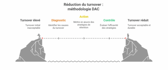
DAC Methodology: Diagnosis, Action, Control
Frame the analysis of each indicator within this virtuous loop:
- Diagnosis (What are we seeing?): “Staff turnover in tech is 30%, twice the national average.”
- Action (What do we do?): “1/ Benchmark salaries on the market. 2/ Launch an exit survey to understand the causes. 3/ Proposal of a skills development plan.”
- Control (Is it effective?): “6 months later, tech turnover has fallen to 18%. We’re rolling out the development plan to other departments.”
Case study: Turnover reduction
Problem: A 500-strong ESN is experiencing an overall turnover of 22%, which is undermining its profitability and employer brand.
Dashboard diagnostics:
- Turnover is 35% among consultants with less than 2 years’ seniority.
- The eNPS for this population is -15.
- The survey reveals that the main cause is a lack of support and career vision.
Actions Implemented:
- Overhaul of onboarding: systematic mentoring, clear 6-month objectives.
- Development program: Creation of technical skills paths and certification courses.
- Career interviews: managers are required to conduct an annual career development interview.
Control and Results:
- 6 months later: Turnover among juniors drops from 35% to 20%.
- 12 months later: Overall turnover is reduced to 15%, generating savings of several hundred thousand euros in avoided recruitment and training costs.
Pitfalls to avoid
- Measuring everything: Information overload kills information. Stay focused on actionable indicators.
- Neglecting data quality:“Garbage in, garbage out“. Inaccurate data is worse than no data!
- Ignore the human factor: A dashboard should not be used to monitor, but to help. Involve managers in its design and train them in its interpretation.
- Not taking action: Measuring without taking action is the worst possible situation. It discredits the data approach.
Conclusion
Too many companies don’t track their KPIs and don’t have dashboards. As we have seen, the dashboard is a formidable tool for decision-making and improving overall company performance.
Don’t hesitate to call on an HR consultant like Boost’RH to set up a high-quality HR dashboard for your company. With his experience, he will be able to guide you in the selection of relevant indicators, and suggest a suitable digital tool to create an effective table, facilitating analysis and decision-making.