
An indispensable HR management tool, the HR dashboard, also known as a workforce dashboard, enables aggregating, visualizing, monitoring, and tracking the evolution of key HR metrics. The HR dashboard thus helps measure HR performance within the company.
While its value seems fairly obvious, its implementation is not straightforward: selecting KPIs, choosing tools or software, updating the dashboard… Setting up and maintaining a dashboard can quickly become tedious.
So, how can you effectively measure and manage your HR with the help of a dashboard? This article provides the methodology and advice for creating an effective HR dashboard that will truly enable you to drive your strategy.
What Is an HR Dashboard?
The HR dashboard enables informed decisions that positively impact the company, through monitoring indicators (HR KPIs). Its purpose is to provide a clear, real-time view of the organization’s human resources health and the effectiveness of HR practices. It is fundamentally distinct from:
Operational reporting: The latter is often static, exhaustive, and descriptive (e.g., list of hires for the month). A dashboard is dynamic, concise, and oriented toward analysis and action.
Complex Excel spreadsheets: Although Excel can be a construction tool, a dashboard is characterized by its automation, interactivity, and visual dimension, allowing intuitive data exploration.
A well-designed dashboard serves four main objectives:
- Drive performance: Track the effectiveness of HR processes (recruitment, training, etc.) and their impact on business performance (productivity, costs).
- Anticipate risks: Proactively identify weak signals, such as rising turnover in a key department or latent disengagement, to enable correction before the situation deteriorates.
- Convince and align: Objectify discussions with senior management by supporting budget requests (training, salary increases) with data and demonstrating the alignment of HR strategy with company objectives.
- Measure impact: Measure the return on investment of HR actions and HR policies implemented (e.g., impact of a training program on productivity, effect of a remote work policy on engagement).
Key Indicators by Management Area
Selecting indicators is the most critical step. They must be aligned with the company strategy, actionable, and based on reliable data. Here is a categorization of essential HR KPIs.
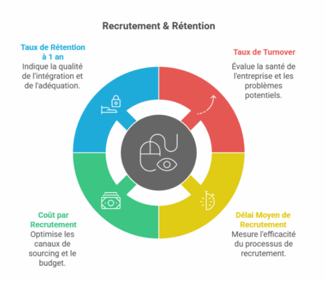
Recruitment & Retention
| Indicator | Calculation Formula | Objective & Insight |
| Turnover Rate | (No. of departures over 1 year / Average headcount) x 100 | A barometer of the company’s health. A high rate signals problems with culture, management, or compensation. A rate that is too low may indicate inertia. |
| Average Time to Hire | Number of days between posting the job and signing the contract | Measures the efficiency and agility of the recruitment process. An overly long timeline causes the loss of quality candidates. |
| Cost per Hire | (Total process cost / No. of hires) + Onboarding cost | Enables optimization of sourcing channels and budgeting for recruitment campaigns. |
| 1-Year Retention Rate | (No. of employees still present after 1 year / No. of hires 1 year ago) x 100 | Key indicator of onboarding quality and recruitment fit. |
Engagement & Culture
| Indicator | Calculation Formula | Objective & Insight |
| eNPS (Employee Net Promoter Score) | % of Promoters – % of Detractors | Measures loyalty and overall satisfaction. “On a scale of 0 to 10, how likely are you to recommend our company as a good place to work?” A positive score (>5) is good, >8 is excellent. |
| Absenteeism Rate | (No. of absence days / No. of theoretical working days) x 100 | Indicator of well-being and engagement. A sudden increase in a team may signal a management, workload, or working conditions issue. |
Development & Performance
| Indicator | Calculation Formula | Objective & Insight |
| Internal Promotion Rate | (No. of promotions / Total headcount) x 100 | Reflects mobility dynamics and career prospects offered to employees. |
| Training Participation Rate | (No. of employees trained / Total headcount) x 100 | Measures the skills development effort. Should be paired with effectiveness indicators (impact on post-training performance). |
| % of Objectives Achieved | (No. of individual objectives achieved / Total no. of objectives) x 100 | Indicator of collective performance and team alignment with strategic priorities. |
Compensation & Compliance
| Indicator | Objective & Insight |
| Gender Equality Index | Mandatory in France (companies with 50+ employees). Score out of 100 points measuring gender pay gaps. Publishing it is a legal obligation, but tracking it is an imperative for social justice and employer branding. |
| Personnel Cost Ratio | (Payroll / Revenue) x 100 |
Basic principle: Start by selecting a maximum of 3 to 5 indicators that correspond to your current priority challenges (e.g., high turnover and lengthy recruitment). Once this initial dashboard is mastered, you can progressively enrich it.
Design Methodology and Tool Selection
Building an effective dashboard is a project in its own right. It follows a precise logic, from defining needs to putting it into production.
Step 1: Identify Stakeholder Needs
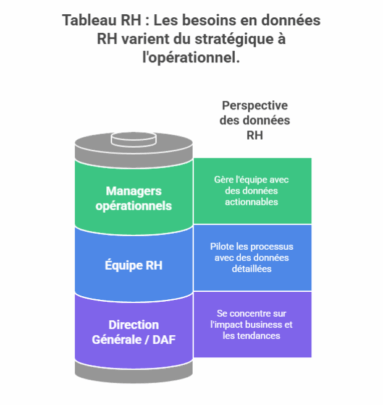 A single dashboard cannot serve all audiences. It is crucial to segment users and their needs:
- Senior Management / CFO: Need for a strategic and high-level view (turnover, HR costs, engagement, diversity). Focus on business impact and trends.
- Operational managers: Need for an operational view of their team (absenteeism, workload, skills, departmental turnover). Data must be actionable on a daily basis.
- HR team: Need for an analytical and detailed view to manage their processes (time to hire, sourcing channel effectiveness, training ROI).
Step 2: Audit and Consolidate Data Sources
Data quality is the foundation of the dashboard’s credibility. This step is the most technical.
- Identify sources: HRIS (Workday, SAP, Peoplesoft), payroll software, recruitment tools (ATS), engagement surveys (HappyIndex, Culture Amp), timesheets, etc.
- Clean and harmonize data: This is the most time-consuming step. It involves correcting inconsistencies, duplicates, and standardizing formats (e.g., consistent department naming).
- Create a single source of truth: Ideally, data should be consolidated in a data warehouse or, as a starting point, in a cleaned master file.
Step 3: Choose the Data Visualization Tool
The choice of tool depends on budget, internal technical expertise, and the need for automation.
| Tool | Advantages | Disadvantages | Target Audience |
| Excel / Google Sheets | Free or low cost, highly flexible, universally known. | Manual, error-prone, difficult to maintain and automate for large volumes. | Small organizations, beginners, prototypes. |
| BI Solutions (Power BI, Tableau, Qlik) | Powerful visualizations, native connections to many sources, automation and real-time updates, highly interactive. | Learning curve, per-user license cost. | All companies seeking a robust and scalable solution. |
| HRIS Built-in Modules | Pre-integrated data, no development required. | Limited flexibility, often less powerful in visualization, vendor-dependent. | HRIS users seeking standard reporting. |
| Specialized HR Solutions (Factorial, Lucca) | Dedicated HR metrics interface, easy to get started. | Less performant for cross-analysis and non-HR data, limited features. | SMEs without technical expertise. |
Recommendation: For a sustainable data-driven approach, investing in a Business Intelligence solution such as Microsoft Power BI (widely used in business) or Tableau offers the best return.
Step 4: Design the Data Visualization and Layout
Design determines comprehension. Follow these guidelines:
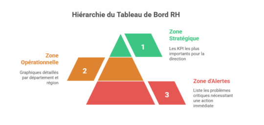
Layout: Structure the dashboard into distinct zones. Here is an example of what is possible:
- Strategic Zone (at the top): The 5-6 most important KPIs for senior management, with their trend and a green/amber/red color code.
- Operational Zone (in the center): Detailed charts by department, region, or role (e.g., turnover by team).
- Alerts Zone: A section listing critical deviations requiring immediate action (e.g., “Turnover > 25% in Department X”).
Visual Guidelines
- Simplicity: Favor simple charts (bars, lines, gauges). Avoid 3D pie charts or overly complex graphics.
- Colors: Use a consistent palette. Convention: green (good) / amber (caution) / red (critical).
- Interactivity: Use filters, slicers, and drill-down functionality (click to zoom into detail) to allow users to explore data.
Step 5: Automate and Industrialize
The objective is to move from manual reporting to an automated process.
- Automate extraction and cleaning with tools like Power Query (included in Excel and Power BI).
- Schedule data refreshes (e.g., daily or weekly refresh of the Power BI report).
- Set up automatic alerts (e.g., automatic email to the HR Director if overall turnover exceeds a certain threshold). Why has the eNPS dropped by 5 points? Is the turnover action plan working?
Leveraging the Dashboard, Steering, and Creating Value
A dashboard without a decision-making process is useless. This is where data transforms into value.
Integrating the Dashboard into Management Routines
Monthly HR steering meeting (“Cockpit Meeting”):
Sample agenda:
- Alert review (5 min): What are this month’s red flags? What action is underway?
- Trend analysis (15 min): Why has the eNPS dropped by 5 points? Is the turnover action plan working?
- Decision-making (10 min): What do we do? Do we allocate additional training budget to Department X? Do we launch a workplace climate survey to understand the drop in engagement?
Weekly report for managers: an automatic email with the key KPI for their team and an alert if necessary. The goal is to familiarize them with data without overwhelming them.
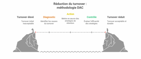
DAC Methodology: Diagnosis, Action, Control
Frame the analysis of each indicator with this virtuous cycle:
- Diagnosis (What do we observe?): “Turnover in tech is 30%, twice the national average.”
- Action (What do we do?): “1/ Benchmark salaries against the market. 2/ Launch exit surveys to understand the causes. 3/ Propose a skills development plan.”
- Control (Is it working?): “6 months later, turnover in tech has dropped to 18%. We are rolling out the development plan to other departments.”
Concrete Case Study: Reducing Turnover
Problem: A digital services company of 500 employees observes an overall turnover of 22%, which is eroding its profitability and employer brand.
Diagnosis via the dashboard:
- Turnover is at 35% among consultants with less than 2 years of tenure.
- The eNPS for this population is -15.
- Exit surveys reveal that the primary cause is a lack of support and career visibility.
Actions Implemented:
- Onboarding redesign: Systematic mentoring, clear objectives at 6 months.
- Development program: Creation of technical skills pathways and certified training programs.
- Career interviews: Mandatory annual career development interviews conducted by managers.
Control and Results:
- 6 months later: Turnover among “junior” employees drops from 35% to 20%.
- 12 months later: Overall turnover is reduced to 15%, generating savings of several hundred thousand euros in avoided recruitment and training costs.
Pitfalls to Avoid
- Trying to measure everything: Information overload kills information. Stay focused on actionable indicators.
- Neglecting data quality: “Garbage in, garbage out“. Inaccurate data is worse than no data at all!
- Ignoring the human factor: A dashboard should not be used to monitor but to support. Involve managers in its design and train them in its interpretation.
- Failing to act: Measuring without triggering actions is the worst scenario. It discredits the entire data-driven approach.
Conclusion
Too many companies fail to track their KPIs and lack dashboards. Yet, as we have seen, the dashboard is a powerful tool for decision-making and improving overall company performance.
Do not hesitate to engage an HR consultant, as offered by our Boost’RH consultancy, to implement a quality HR dashboard within your company. With their experience, they can guide you in selecting relevant indicators and recommend a suitable digital tool so you have an effective dashboard that facilitates analysis and decision-making.